Tuesday, 17 April 2012

Candidate Details

CANDIDATE NAME:
Charmaine Tsitsi Musonza

CANDIDATE NUMBER:
5083

CENTRE NAME:
Wilmington Grammar School For Girls

CENTRE NUMBER:
61119

Link to my AS blog

http://charmainemusonza.blogspot.co.uk/

Evaluation Question 4

How did you use media technologies in the construction, research, planning and evaluation stages?

Evaluation Question 3

What have you learnt from your audience feedback?


Trailer:
I have already done one post looking at some of the feedback that was given to us after we uploaded our trailer on Kate's Facebook. You can find the first feedback post if you follow this link: http://charmainemusonzaa2media.blogspot.co.uk/search/label/feedback

Looking at the feedback we received, it is clear that our final film trailer was a success among our friends, and it genuinely had a few people feeling scared by the end of it!

Here are some comments I selected from when we uploaded the trailer to Facebook. The main replies mentioned how they thought the sound complimented the clips well, and how the last scene where the abductor can be seen climbing up the stares as 'Lily' struggles in the closet, is the best part of the trailer, as it genuinely left some people feeling terrified. Another thing people applauded was Georgie's realistic acting, which we were pleased about because she had never acted before, and so we were worried that her acting within the trailer may not look as realistic as it should. Everyone also liked that we overlapped the sound and the clips to make the clips at the beginning look like flashbacks and memories. It was a feature that we had to teach ourselves as we had no idea how to use the programme.


One comment we received was from when I uploaded the trailer onto my Tumblr, and a friend suggested that adding heavy breathing during the scene where the two friends, Shannon and Chelsea, can be seen talking, would make it more effective in building suspense and tension. This was something we had considered, but when we initially tried to record the sound of heavy breathing, our attempt was unsuccessful, and so the idea was abandoned.


Ancillary tasks:
As we mainly focused on getting feedback for the trailer because the ancillary tasks hadn't been made at the time, I asked a few friends to comment on what they liked and disliked about our movie poster and magazine cover. Below I have included some of their comments:
  • Isabel: I really like the layout of both the poster and the magazine cover. I think they go really well, and I like the photo of Georgie on the magazine cover as well.
  • Char: I loved the scene in the closet, and the music you chose to accompany it fit really well. For the cover, I like the font because it fits really well, and so does the colour scheme. I also like how you mentioned actual magazine offers on there, like Avengers Assemble. On the poster I like how the darkness of the legs contrasts with the browny tone of the rest of it, and the font is really eye-catching.
  • Rachel: In the trailer, I like the bit with the feet because it's a bit different, and I like the part where he's coming up the stairs because it's all mysterious and the music makes it all tense. I think the poster's really clever and kind of creepy-looking, which works well because it's like a thriller. I also like the colours you used too, where the background looks all warm because it's kind of ironic. And I like the fonts on the magazine cover because they're all really clear to read, and you've picked good colours, because they're nice and clear. Oh, and I like the "Seized" font, and the photo is good. Nice and spooky.
  • Kate: I really like the simplicity of the movie poster as it doesn't give anything away. I also liked the part in the trailer where the feet stop in front of the camera before picking up the phone, as well as the part with the girl screaming in the cupboard. Well done guys!!

It is clear to see that people liked the poster the most as they felt although it was quite simple, like The Sixth Sense, it was still effective. Many friends commented on how they liked that the brown/orange glow behind the abductor's legs was a nice touch, as it was a nice contrast to his dark clothing and the genre of the film, which is supposed to be scary/eery. Using real movies and names on the magazine cover was also praised, as some people felt it made the magazine cover look like it could really be sold to our target audience.

Evaluation Question 2

How effective is the combination of your main product and ancillary texts?


Evaluation Question 1

In what ways does your media product use, develop or challenge forms and converntions of real media products?
Click the bottom right corner to enable fullscreen.

Friday, 30 March 2012

30/03/12 - Making the magazine cover

Firstly I opened the image up in Adobe Photoshop CS4 so that I could edit it, and then I clicked on many of the tools and effects so that I could become more comfortable with the programme.
Afterwards, I adjusted the brightness and contrast so that her makeup, dress, and messed up hair would be easier to see. This effect also meant that the marks and makeup we had put on her face to give the impression that she has been kept in the closet for a long time as her face is now dirty, appeared darker, making it more realistic.

After changing the brightness and contrast, I decided to add a red tint to the image, as red is often associated with danger, red, and violence. I thought that this could link well with the film trailer, as she has clearly been kidnapped by this stage. The red tint also emphasis the makeup we put on her face to make her appear dirty, as well as highlighting her scruffy hair.

While I began editing the main image, I opened Adobe InDesign CS4 so that I could paste the barcode, as well as create the black banner and the blue circle outlined in white which would all feature on the magazines front cover. I made the black banner by creating a rectangle and filling the shape in black, and then did the same for the circle, but made the inside pale purple, and changed the outline weight of the white line to 8 so that it would be bold and noticeable. I chose to use pale purple as the clothes that can be seen at the top of the image, as 'Lily' is still trapped in the closet, show some pale blue and purple shirts. By using the ink drop tool, I was able to grab that colour and use it on my product.

Switching back to Photoshop, I added the main text 'Film Media', as well as 'Magazine of the Year'. Using my research, I remembered that I had planned to make the main text link to the image used on the front cover. Using the ink drop tool, I grabbed the colour of 'Lily's' dress, chose a slightly darker version so that it could easily be seen, and then added it to the text. I chose to just use white for the sub-heading as this had also been seen on similar magazines.

When adding the title of the film to the magazine cover, I decided to use the same font that we had used on the film poster and in the trailer, as this corresponded with my other research and typical film magazines. I also included the films slogal, "A Modern Cat and Mouse Game", which was also included on the poster and in the trailer itself. I decided to just keep the font white so that it would stand out against the dark background and harsh colours like the red. Using a lighter colours means that the words can jump out at the reader, which would hopefully help to grab our target audience. The white also creates a link with "Magazine of the Year".

Using the purple circle I had created earlier in InDesign, I added the shape onto the front of the magazine cover, adding text over the top of it in black, choosing a darker version of the purple to highlight the name of the film mentioned. By right clicking the layer that said "Vector Smart Object", I was able to rasterize the text so that I could click the corner of the text box and rotate only the text so that it could be on a slight angle. This feature is often placed and arranged like this on similar magazines. I also pasted the barcode from InDesign into the bottom right corner.
 
 Using the same pale purple colour, and white, I added small amounts of text around the image, following some examples on other magazines. As the film is about a kidnapper, I thought it would be appropriate to mention an article on the front that could link with the idea of villains and heroes, which is why I offered a list of the best in film history. Like I had seen on magazines like 'Empire', I added a 'Plus!' and included another offer underneath it.

When I had finished making my magazine, I moved the text that hovered over the black banner, so that the writing was spaced out a little more, but still wasn't touching the line. I also used the lasso tool so that I could select the shirt that hovered over the top of 'Lily's' face so that the area could be coloured in black and blend in with the banner, as before it created an odd shape above her that could have distracted from the magazine. Offering things like free posters and exclusive interviews is often seen on the front of magazines, and so I tried to ensure I included them on my own magazine front cover.
This is the completed magazine cover!

Tuesday, 27 March 2012

27/03/12 - Making the poster

This is the final image we decided to use for our film poster, which is from the second photoshoot.
After the image was opened up in Adobe Photoshop CS4, the brightness and contrast was adjusted to make the orange/yellow background that was created naturally by the lights, brighter and more vibrant. We had tried to make the entire background a similar colour throughout the entire poster by using the Clone Stamp, but as it was the first time we had ever used the tool to create the effect, we accidentally made the banister behind the abductor appear pasted above the actual banister.

We managed to remove the banister from the background but we still wanted to make the entire background similar throughout, with the dark orange at the bottom blending into the pale yellow at the top. We tried using the paintbrush tool but that would have taken too long, so we tried to use the Clone Stamp again on the left side of the poster.
 
As you can see in this picture, we eventually managed to use the Clone Stamp to make the background fade into each colour on both sides, and removed all of our previous mistakes.

Next, we added some text to the poster. The title and the slogan from the film trailer were placed over the top of the image. Using the Ink Drop tool, we grabbed the dark orange colour from the left side of the poster and found a version of it that could be seen clearly against the background. Following our research, we kept the slogan white and bold so that it would not distract from the main title.
We went onto our film trailer as if we were going to edit it on the programme, but selected the text that we had used at the end of the trailer so that we could place it at the bottom of the poster. It contains the usual information regarding copyright and who was involved in the making of the film. This is something that we have seen on many movie posters before. This text was also kept white as it is rarely in any colour other than white or grey, so as not to distract from the poster itself.

The completed poster!
We finished creating our poster, but felt that the slogan underneath the title was not dramatic enough for a thriller film. After changing the slogan to "An innocent walk home becomes a game of cat and mouse" makes the film appear slightly more dramatic, which could help draw in our target audience. We also extended the bottom of the poster, making it longer so that the white text could rest at the bottom in the orange space instead of over the shoes.

Monday, 26 March 2012

26/03/12 - Second photos for film poster

After reshooting the image that we would use for our movie poster, these were the best ones that were taken. They are significantly lighter and are not blurry, and so we can adjust the brightness and contrast to make them darker to create an eery and creepy effect.  We will use one of these to create our final film poster as they can easily be edited. Unfortunately, we could not removed the window entirely from the image, and so when we edit the image in Adobe Photoshop CS4 we will try to crop the image so that the window cannot be seen as much in the background. If we try and create an orange eery glow around the image like the one used on The Sixth Sense poster, the window may be lost in the glow, making it less noticeable.

 
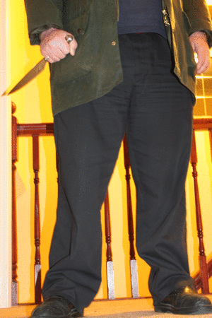
To add more terror to the image, we tried adding a knife to the abductors hands as well, but it did not link with our film trailer, as in this particular scene he cannot be seen holding a knife. We must focus on continuity between all of our products, so we have chosen to discard this particular idea.

Sunday, 25 March 2012

25/03/12 - Design for magazine cover

I decided to draw this rough plan of a magazine cover so that we could follow it when creating our own magazine cover. It follows a similar design to the magazine 'Empire' which I evaluated earlier in my blog posts. It was a simple design, and the areas that suggest using text would only have a few words in that area, like the actual 'Empire' magazine does.

25/03/12 - Font research for magazine cover

As I'll have to make a magazine front cover that links into my film trailer, I thought it would be useful to do some font research on other magazine covers. This will help me establish the norm for the titles, allowing me to follow the conventions so that it may be more attractive to my target audience. I have printscreened the titles for magazines, 'Empire' and 'Film Ink'.
Both have block and bold prints, and use one colour of two, unless they are trying to link the title to the movie. For example, one of the titles for 'Empire' is bright blue to link in with the feature, which is the Iron Man 2 movie. This is a technique I will use when creating my own magazine front cover, as linking the title to the main feature could grab the readers attention more.

Friday, 23 March 2012

23/03/12 - Second photoshoot for magazine cover

After our first photoshoot we knew that we needed to reshoot the photographs so that they focused more on the film and the character 'Lily'. Kate photographed her outside to get more in character shots of her. The first two appear to be too comical to use for a thriller film trailers magazine cover, and so they cannot be used. The bottom two, while she does appear to be more scared and worried, you can faintly see a green bin in the background of the image of the bottom right photograph. The third photograph which is in the bottom left shows her covered by the sun, so her body is not as defined as it could be. As a result, we have decided to use photographs that we took when doing our fourth shots for filming our trailer, as in these the situation looks more realistic. Below is an image from the many that we took during the filming of our fourth set of shots, and it is the image I will use when creating the magazine cover.

This is the image I have decided to use for my magazine front cover.

Wednesday, 21 March 2012

21/03/12 - Feedback for the film trailer

We uploaded our thriller film trailer to many different social networking sites, using Twitter, Facebook, and even Tumblr to distribute it to a wide audience.

Blogger allows you to view statistics on who is viewing your blog by showing you the amount of pageviews you have been getting either on one particular day, month, or since you started your blog.
Jeni uploaded the trailer to her Twitter page so that her follows could comment on it by either retweeting it, favouriting it, or replying to her original tweet. This meant that people that may not have been a member of the other social networking sites would have been able to see our trailer regardless.

Kate uploaded the trailer to her Facebook page, which meant that over 200 people would have been able to see it. After only an hour, our trailer already had a substantial amount of views, and had managed to gain 10 likes, and was commented by 9 people.

I uploaded the trailer to my Tumblr, which is a website that allows users to blog, post photos and videos among other things. It gained 12 notes as a result of the likes and comments people replied with, as well as those who reblogged it from me, which meant the video was also on their blogs, exposing it to more people that could comment on it and offer us feedback.

Shortly after uploading our video to these social networking sites, our thriller trailer gained 90 views, which we were very pleased to see. Overall, we recieved a fair amount of good feedback, as well as a few points that we could have improved on.

Tuesday, 20 March 2012

20/03/12 - Finished film trailer!


20/03/12 - First photoshoot for magazine cover

This image shows the photographs taken at our first photoshoot for the magazine cover. Many of the images show 'Lily' smiling, which does not correspond with our film, as she is being kidnapped in it. We used this photoshoot to remember certain camera effects and techniques that we had forgotten, which is the main reason why she cannot be seen in costume. We will do a second photoshoot of 'Lily' in costume so she looks more like her character.

Monday, 19 March 2012

19/03/12 - Editing the film poster

Here is a printscreen of the image that Jeni opened in Photoshop CS4 to begin the editing process. After changing the brightness and contrast, the image developed an orange glow that was similar to the one used on The Sixth Sense poster we were trying to imitate. She also tried to blur some areas to blend in some of the harsher lines. We may retake this photo so that the legs of the abductor are more in the centre of the poster so that they can be focused on more. We also ensure that the window cannot be seen in the background, as it distracts from the image and lessens the impact it could have.

This poster is what we have taken inspiration from, as it is simple but also effective. By using only the one image with the number 6 in an orange glow around the dark, unidentifiable body, and the simple white text used for the title, they have created a poster that draws the audiences attention. It is an image that sticks in your mind, which is why we have used similar ideas when trying to create our own film poster.

19/03/12 - Poster text research

We used The Sixth Sense poster to help us create and develop our own poster, so we looked at the text used on the poster so that we could use a similar one. We have decided to use the font Weathered SF on our poster as it is also used in our film trailer, and so we thought that it would be appropriate. To ensure that our movie poster followed the normal conventions, I thought it would be helpful to research into poster text. This could help us with ideas on how to present the text, like what effects we could use and what colours.
The text used for The Sixth Sense is the one that is also used in the film, and it is written in a bold font that looks wavy and bumpy, almost mimicking the appearance of a ghost, linking into the movie itself. They have also decided to keep the text one solid colour, making it easy to see and bright on the dark background.


On this poster for the movie SALT, the text is kept very simple. The only colour used is white, and the only effect is the shadow of the words behind the text 'SALT' placed over one image of the main character.


The only things they have mentioned are the date it is released in cinemas and the website to visit that will offer information on the movie. By keeping the text minimal, they make sure that the audience is drawn in as they could glance at it and still recieve all of the vital information. The Sixth Sense poster also doesn't have a lot of information presented on it either.


The only information presented on the poster for the movie Orphan is the slogan, "There's something wrong with Esther" placed above one simple image of the main character, which is a line one of the characters may say in the film. The name of the film is in the same text used within the film itself, which is also a similar technique used by The Sixth Sense and the SALT poster. Underneath the title is another slogan that reads, "Can you keep a secret?" which also links to the film.

We will use these techniques when creating our own movie poster:
  • Use the same text that is used within the film trailer for the movie poster
  • Keep the colours simple, but ensure they link to the image
  • Place a short slogan beneath the title of the movie
  • Only use one image that is of the main character/the abductor and place the text either above or on top of the image

19/03/12 - Initial poster ideas/photographs


Jeni drew this rough sketch of a potential film poster we could create for our film. The design is simple and follows a similar design to The Sixth Sense poster (on the left) we drew inspiration from. That poster also has a minimal amount of text, mainly focusing on the image by adding an eery orange glow around the image. We plan to try and use a similar effect on our own image.

 
Here are the images we have considered using for our film poster, which show the abductor in the film trailer in his last pose - standing in the doorway near 'Lily' who he has kidnapped. We will reshoot these images so that we can get a clearer, and perhaps lighter image that we can edit. After retaking the images, we will edit them to add the orange glow around the image.

After talking with the rest of the group, we all decided that using a picture of the abductor walking up the stairs which can also be seen in the film trailer, would not have the same effect as the image of him standing still in the doorway. As a result, this idea was abandoned.