Tuesday, 31 January 2012

31/01/12 - Sound

gif maker
Foley work:

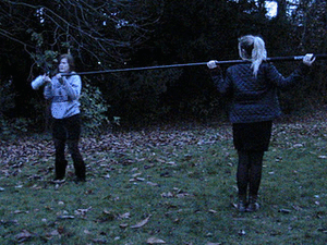
Having faced issues trying to get our actresses to film some scenes after school, we decided to focus on recording sound and researching music for our thriller film trailer instead. When we first tried to film sound for our film trailer we encountered many problems. Trying to record fast footsteps and the wind proved to be a task we had originally thought would have been far from difficult. Using the natural sound that we created while filming our first few shots did not work as well as we had imagined, and so we began doing some foley work of our own, so that we could find the process easier when creating the sound for our final trailer.

Definition of foley: Foley is a term that describes the process of live recording of sound effects that are created by a Foley artist, which are added in post production to enhance the quality of audio for films, television, video, video games and radio.
We recorded each other walking on some fallen leaves, but because the boom that allowed us to extend the cameras reach made some creaky noises, it interfered with the sound recording of the leaves. As a result, we had to arrange another day to record more sounds. Along with these recordings, we also recorded ourselves breaking branches and a bird that could be heard in a tree.

V1:


V2:


Video 1 & 2: When our main character is walking alone in the field, we wanted it to sound like she was walking upon some leaves. The sound was not loud enough when we actually recorded her walking on the leaves, so we crunched up leaves next to the microphone instead. This created a similar effect, and made the sound clearer and louder. The first clip shows our first attempt, and me walking on leaves, and the second shows Jeni crunching the leaves with her hands to create a better sound.

V3:
Video 3: A sound we tried to recreate was her footsteps. The sound of her actually walking could not be heard on the clips, and so we tried to record one of our team members walking slowly and then picking up speed. This idea worked more, and so when creating our final sounds for the trailer, we could re-record our own footsteps again.


V4:


V5:


Video 4 & 5: We wanted to record the sound of branches moving and twigs breaking, and so the first time we tried to record that sound, we had Kate shake the branches of a tree, but the sound wasn't picked up very well by the boom. The second video shows Jeni breaking the twigs with her hands, which created a clear and crisp sound. This could be used while Lily is being followed in the fields, to show that someone is behind her.

V6:


V7:


Video 6 & 7: We tried to recreate natural sounds, as well as record them. The first video shows our attempts to record the sound of a bird that we could hear in the trees. We felt that it would be a nice sound to play when Lily is walking/running through the fields, as it could add an eery feel to the shot. The second video shows one of us trying to recreate the sound of wind by breathing over the boom, as no wind could actually be heard when we were recording, but unfortunately our attempt wasn't successful.

Sound effects:

As well as researching foley work, I thought it would be a good idea to look at different sound effects that we could potentially use with our own trailer. I looked up the sound of footsteps to compare them to our own recordings. I also thought it would be useful to research into someone recreating the sound of a person breathing, as this is something we had trouble recording effectively.


This sound clip has been recorded by another user on Youtube who tried to recreate the sound of someone walking along a dirt track. As our trailer is mainly being filmed in a field, it is something we could possibly use, or try to create ourselves. As the pace is fairly slow, it would only be of use at the beginning of the trailer, where the young girl is unaware that she is being followed. As she begins to run, we would have to ensure the sound of the footsteps also quickened.


Failing to find a decent sound clip of someone breathing, I thought it would also be useful to research into the sound effects of someones heart beating faster. This could be played, along with the music, as our main character is being chased through the woods.

Research into composers:

Another important part of our film trailer is the music we will use throughout. As a team, after being given some suggestions, we researched some composers who we felt had created a piece of music that we could use to create suspense and tension.


Krzysztof Penderecki - Concerto Grosso No.1 in c minor: This particular piece of music has an eery feel to it, which is created by the cello's, and violins. The subtle use of what appear to be cymbals also add to the eery atmosphere. As the piece continues on, the music becomes louder and from 1:00-1:40 the music becomes increasingly louder, and if paired with our trailer, it could be used during the scene where our actress is chased. 1:30-1:40 particularly sounds like music that would be effective in conveying the danger the young girl is in, and what a crucial role her kidnapping has in the film.


Jose Serebrier - Greenberg - Symphony No. 5: This classical piece of music is also very dramatic, and could potentially be used within our film trailer. Up until 1:20 the music is slow, and the instruments played create an eery sound because they create a low sound that builds tension. At 4:30, the music becomes significantly louder after the buildup and stays loud until 5:26. The video is also full of parts where the music is quiet and the instruments played create high notes, which could be used on parts like when our main character "Lily" hears her kidnapper coming up the stairs towards her.

Hans Zimmer - The Ring End Credits, Time, and The Dark Knight Theme: When researching composers and pieces of music we could possibly use for our trailer, I remembered Hans Zimmer composed a piece of music called "Time" for the film Inception,  and so I thought it would be a good idea to research into some of his music and see if any could be used in our trailer.


This piece of music has many moments that could be used to build tension within our trailer. Although it moves at a slower pace than other music, there are moments when the volume increases dramatically, which could be used effectively. The first minute is quiet and creates an eery feel, which could be used to create suspense and tension at the beginning of our trailer, when "Lily" is seen walking in the field alone. At 2:02 a beat can be heard behind the higher notes of the instruments, which could be used when she begins to run away from her kidnapper, and could potentially work effectively because it sounds similar to a heart beat. While the entire piece would not work for the entire trailer, there are elements of it that could be used.


At some points during this theme, the music sounds too uplifting for our thriller trailer, but certain parts like the music at 3:42 until 4.16 where the music is dramatic and loud could be used for when the kidnapper is seen walking up the stairs towards "Lily". The volume increasing could show the danger she is in and the severity of the situation.


From 2:00 until 3:10 the music becomes intense and dramatic, giving off a creepy and eery feel that could work effectively in our trailer when "Lily" is walking alone in the field, or as our other two main characters, "Shannon" and "Chelsea" realise they are being watched in the field, or that their friend may have been kidnapped. From 6:50 until 7:15, the music is mainly very low notes that also add to the tension and suspense, and so this could help us when trying to make the audience uneasy because of the events occuring in the trailer.

Monday, 23 January 2012

23/01/12 - Ancillary tasks - Magazine cover research

After researching thriller film posters, I thought it would be a good idea to go away and independently research magazine covers that focus on films as well. As a film magazine cover is the second ancillary task we must complete, the research will prove to be helpful.

Uncut magazine, trademarked as UNCUT, is a monthly publication based in London. It is available across the English-speaking world, and focuses on music, but also includes film and books sections.

The title on each issue is in the same  red bold, block print. It is often placed behind the main image, but the plain grey backgrounds enable the reader to see it clearly.

Each issue features the name of the band or artist that is the subject of the main music article, in the middle of the page. It has a slogan above the name of the artist(s) and a sentence below the name that gives a hint as to what the article will focus on. For example, the slogan used for the article focusing on The Clash was, "Revolution Rock!". The colours used are a similar red to the title, as well as white, with black to highlight some text.

At the top of the front cover there is often a highlighted strip that mentions another article or feature within the magazine as well as a free CD, and a image that relates to the feature. Often interviews or reviews.


On the left side of the main image there is usually a quote which is related to the main article, or something that just indicates what the main feature of the issue is.


The bottom of the magazine shows small columns that mention other artists that will be mentioned throughout the magazine, albums that will be reviewed, and other articles they will feature. The colour scheme continues, as red, black and white are still used predominantly. Yellow is introduced as well, which would draw the readers attention towards the text.

Overall: The magazine uses a fairly simple colour scheme, choosing to use three main colours (red, black, white), and occasionally use another colour to ensure the reader looks at that particular part of text. The magazine offers things like free CDs and posters for readers, which would help to ensure the magazine would continue to sell. The images used usually have the artists in similar poses, for example, both feature an artist with their arms folded. It merely has the artists standing there, rather than choosing a particular pose, which could indicate how serious the magazine is. The layout of the magazine appears the same on every issue. I decided to go away and research two other magazines that focused more on films, compared to Uncut.

FILMINK features content from Australia and abroad. It reviews mainstream films, local pictures and arthouse and independent fare.

The title is in a plain block print, and is in the same position and style on every single magazine. This is similar to Uncut, but it is a rule that Empire does not follow. Changing the title style and colour may be an effective way to draw in customers as it's interesting, but may also confuse some people if the magazine is not always recognisable.
Every issues has information listed down the sides of the magazine, either over or around the images to advertise the other features within the magazine, like interviews and reviews. This is a common feature on most magazines, as it introduces the rest of the content to the reader. 


Under the information on the left of the magazine is the barcode, which is in the same place on every single issue. The colour scheme for the information is usually a pale yellow or green, which can sometimes make the information a little bit difficult to read.
The title of the film that is the main focus of the magazine is in the same block print and colour on every issue, which can be seen here. The first word in the title is enlarged slightly to draw attention to the film, keeping the readers attention on the main focus of the issue. Above the title of next to it is often a slogan that the magazine has created to describe or introduce the movie. For Alice in Wonderland, they used "welcome to Tim Burton's tea party" as the slogan, introducing the fact that it was created by Tim Burton, who has made many popular films in the past.

 Overall: The magazine uses a similar colour scheme on every issue, as well as the same fonts. This creates a continuous theme throughout the many issues, meaning that the magazine would be easily recognised by the reader. The main image is of the main characters involved in the movies, and usually has images that overlap instead of just one single image of an actor/character, which is what Empire and Uncut prefer to do. The actual layout is fairly simple, with the image being the main feature, with little text down the sides of the page. The page doesn't seem cluttered because although the text does advertise features like posters, the page is not littered with loads of text or symbols offering different things, making it easier to read quickly.
 
Empire is a British film magazine published monthly by Bauer Consumer Media. It reviews both mainstream films and art films, but feature articles concentrate on the former.
Each issue uses the same font and size every time, but changes it so that it can relate to the main feature. They have left it clear and white to tie in Captain America's shield on the first image, made it glowing blue for Thor's issue, and made it look like splattered blood for the Kickass issue. Personalising them like this adds a variety to each issue, rather than keeping the same font each time. It also makes the magazine more eye-catching. Additionally, above the title there is usually an offer like free covers, an exclusive review on a film, or they put "magazine of the year" above it to draw in more customers. Broadcasting that they achieved this title means that they can hopefully gain more of an audience, as they will be seen as the best.

The name of the main feature is placed in the middle of the page, stylised in a way that would be associated with the movie. It is always in a clear, bold, block print so that it can easily be seen. This would help when drawing in readers as we often only glimpse at the front page, so if it can draw us in with the image and fonts, we are more likely to read the content. Around the title of the film, the magazine often write a little slogan. "It's bloody! It's brialliant! And, boy, does it Kickass" is the slogan they used to gain the audiences attention. "How Summer's biggest superhero went to war" and "... The mighty Thor. World-first look at Marvel's superhero god" are the slogans used for the other films. Mentioning that it's an exclusive or first look at a film would make the magazine more appealing because it would not be competing with any other magazines in terms of solid and correct information related to the film. 

Around the main image or at the bottom of the front page, the magazine will often offer new posters, special reviews and interviews, and information on the release of popular movies onto DVD. Offering little exclusive gifts would also draw in customers because they would be given the opportunity to get it before others.


Overall:
When looking at the magazine for the first time, it could appear cluttered, but the majority of the front page is just the picture, which has been edited and photoshopped to make it look more appealing. The magazines colour scheme and theme is linked to the focus of the magazine. For example, the magazine looking at the movie Kickass used fonts and styles that would typically be seen in a magazine, such as bright, bold and eye-catching colours, as well as a slogan for the superhero: "It's bloody! It's brilliant! It's Kickass". Behind the image of the main actor - Aaron Johnson - images of the other two superheros (Big Daddy and Hit Girl) involved in the movie can be seen in their comic book theme, creating another link to the actual film. This is also a common choice for other magazines, as the Thor(God of Thunder) magazine shows the title glowing blue like the films title, while lightening bolts can be seen over the front page which also creates a link to the superhero. Out of all of the magazines I researched, Empire was my favourite because it was the one that truly grabbed my attention. Many of its features I hope we can recreate when we make our own magazine cover.


Conclusion:
When creating our own magazine cover, it'll be a goal to include some of the main effective features of the magazines I have researched. For example - 
  • Using Empire as a guide, we could use bold colours/fonts that create some sort of link to the film. An eye-catching title is often what draws the audience in first. We will also list a small amount of the features within the magazine alongside the main image, to show what else the magazine has to offer.
  •  Images that show the characters clearly, like Film Ink did, would show the focus of the magazine. We could photograph our main characters in their costumes, and mention an interview with the stars or a review on the film as a feature. This would effectively bring in an audience that finds an interest in who is being mentioned within the magazine.
  • Offers like free posters or vouchers that enable the reader to purchase DVDs at a reduced price would be another feature to include. This is a tactic that all three magazines used. By offering exclusive free content, they can try and almost bribe the audience into buying their magazine instead of a different one.